 Eduardo de Souza
WA Belloa Design System
Product Design Manager · 3 Designers, 2 PMs, 3 Engineers · Ongoing
Context
WA Technology is a B2B iGaming provider offering white-label templates across sportsbook, casino, lottery, and fantasy verticals. Following a series of company mergers, the product ecosystem was highly fragmented — each acquired platform had its own tech stack, its own legacy components, and in many cases no original design files to work from.
The Challenge
Before Belloa, our team of three designers operated in a reactive environment. We were working without source files, scraping live screens with plugins just to have something to edit. Each product vertical had its own developers working in isolation, building on incompatible legacy libraries with no shared standards.
The problem wasn't just visual inconsistency — it was structural. We needed to fix the foundation before we could build anything that would last.
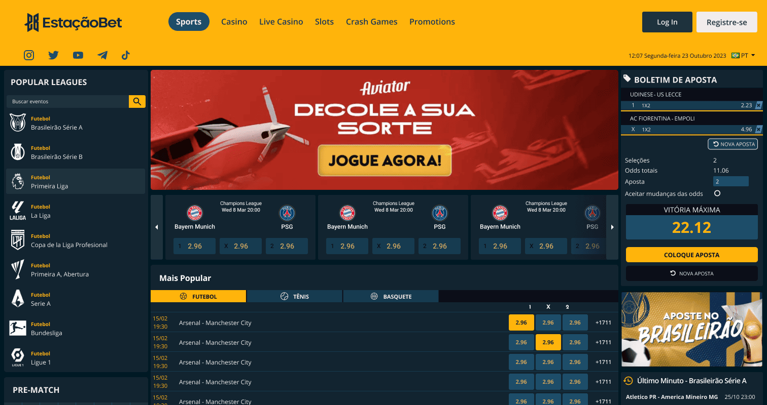
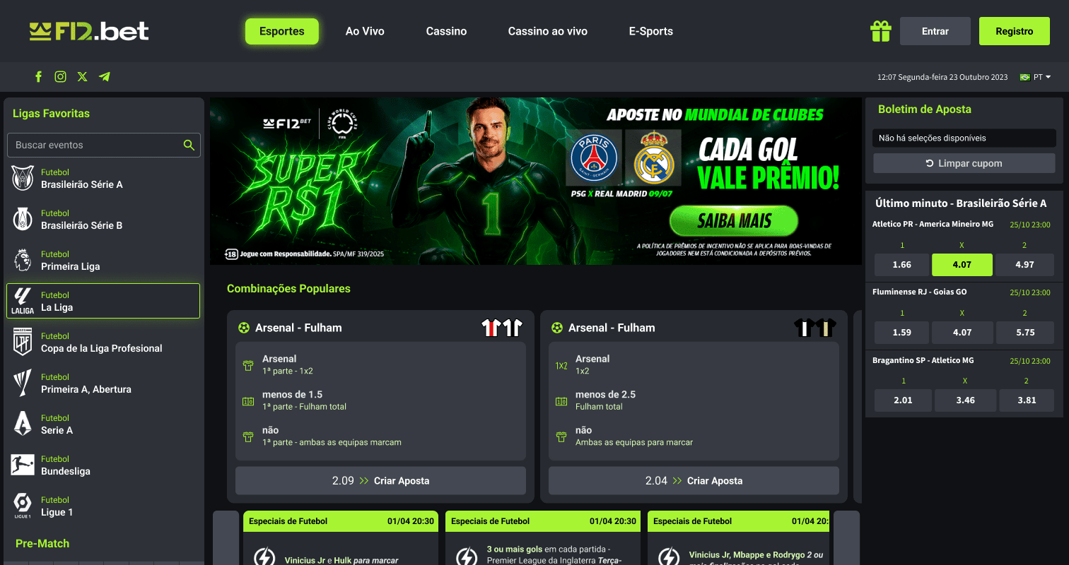
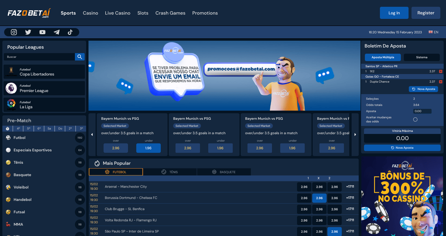
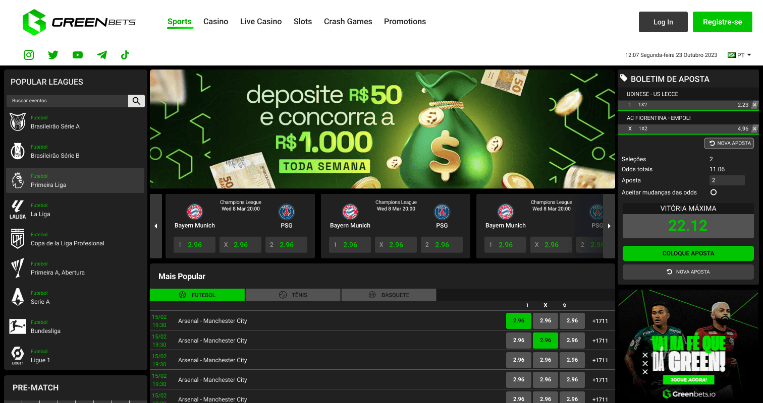
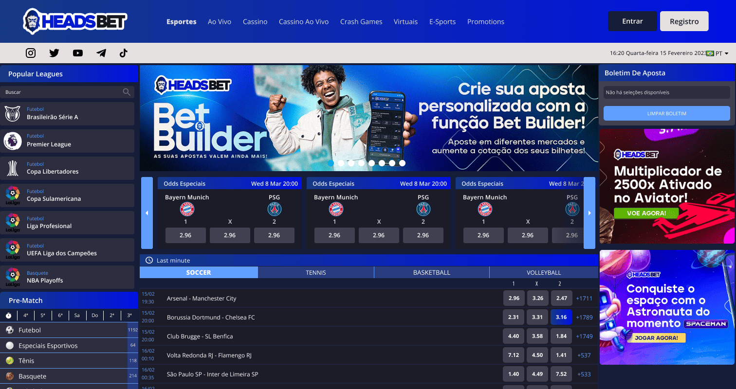
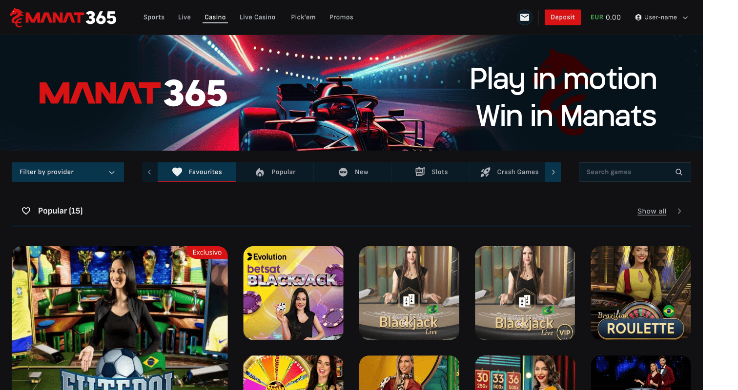
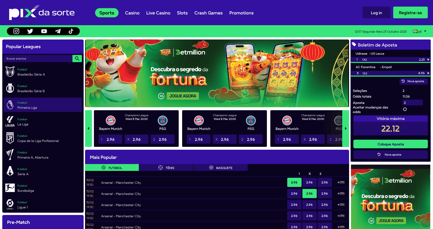
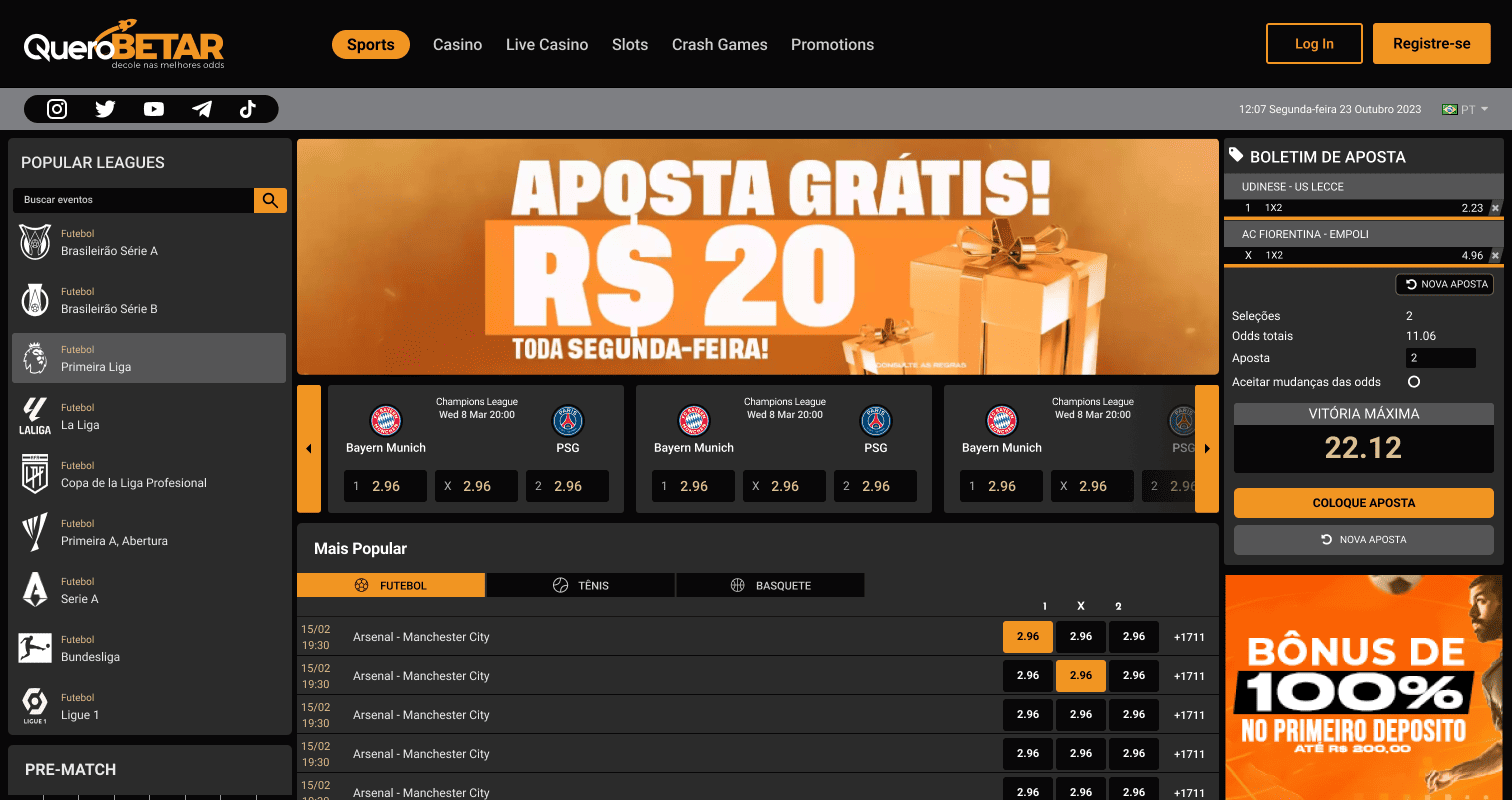
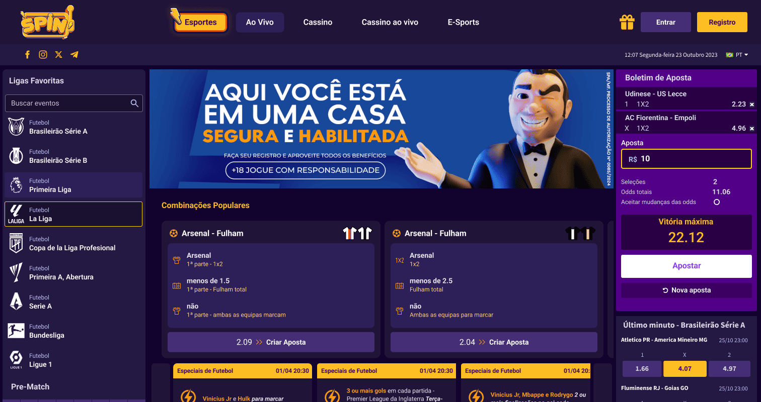
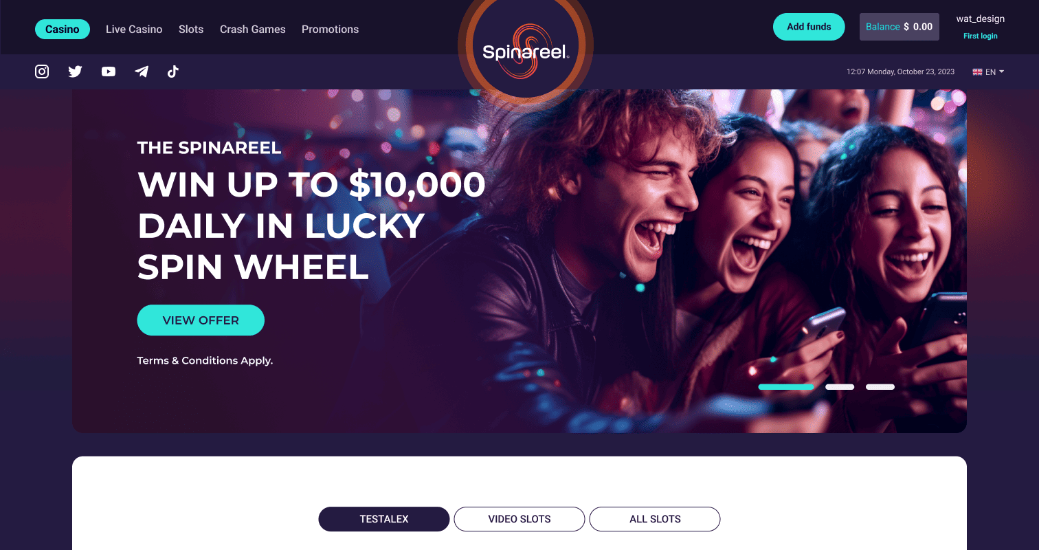
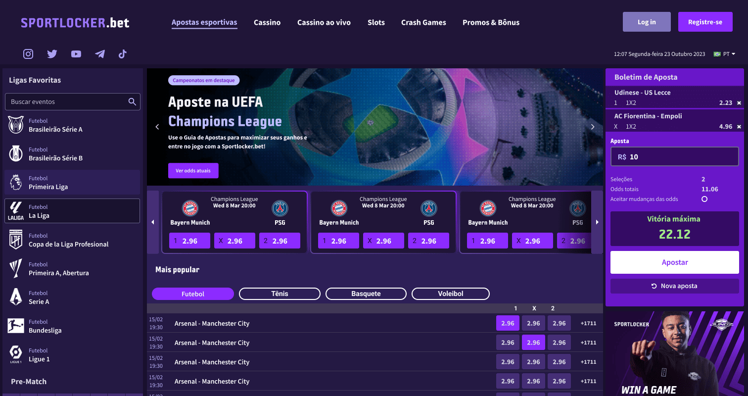
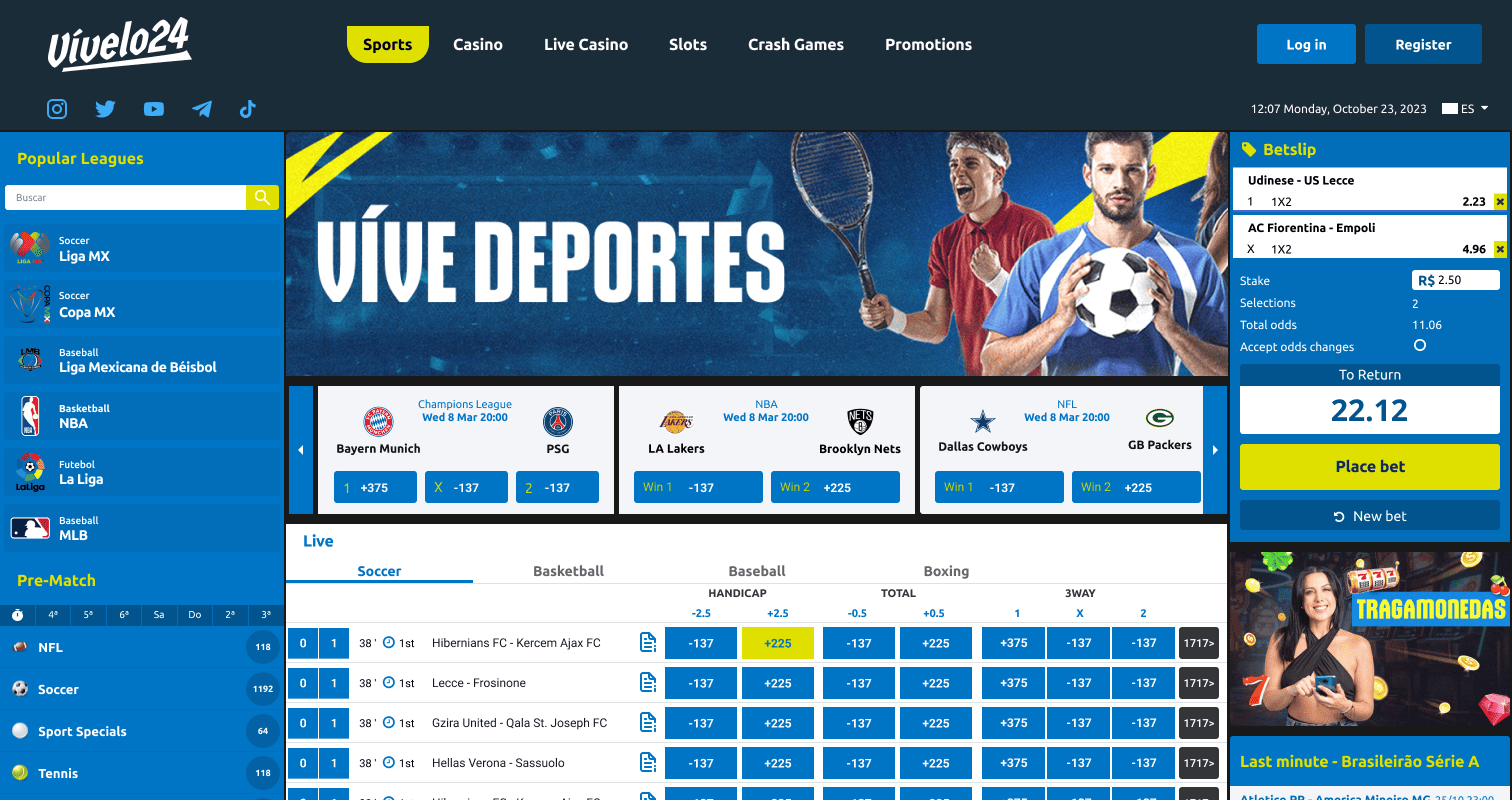
Before Belloa — isolated verticals
Audit and Foundation
We started by mapping everything that existed. A system-wide audit across every front-end product under the WA umbrella — cataloguing components, headers, footers, interaction patterns, and duplicated logic. From that audit, we retroactively converted the live products into a foundational set of Figma components, giving us a baseline to work from rather than a blank canvas.
We also mapped how different verticals interacted — particularly how fantasy games were embedded as iFrames inside sportsbook and casino platforms — to ensure any new component architecture would be compatible across the stack.
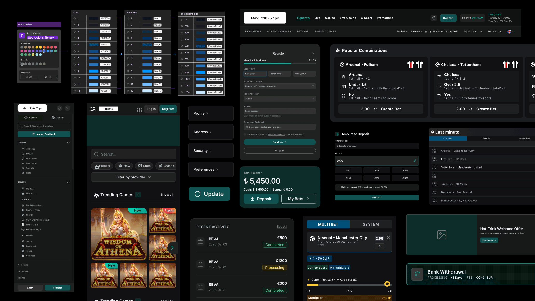
The Radix Decision
Rather than build primitives from scratch, we made the strategic decision to adopt Radix UI as the foundation. Radix provides unstyled, accessible React primitives built on ARIA best practices — we could layer iGaming-specific styling on top without reinventing accessibility or fighting browser behaviour.
This eliminated an entire class of problems and meant every WA product and white-label client inherited a robust accessibility foundation from day one.
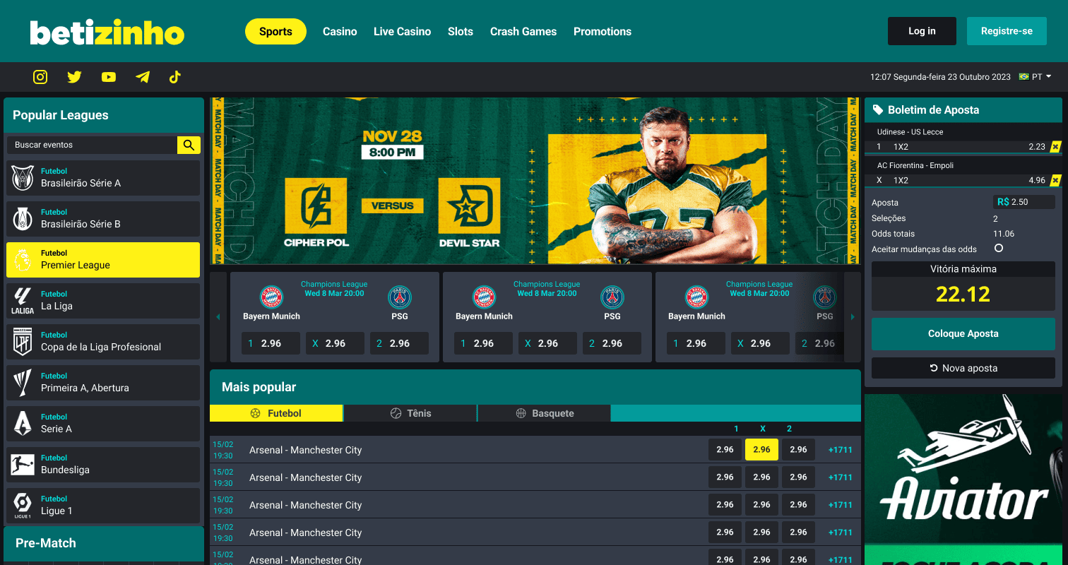
Pick'em as the Proving Ground
In parallel with the audit, the team was designing Pick'em — a greenfield fantasy product built entirely from scratch. That clean slate made it the perfect testing environment for the new component library. Every decision we made in Belloa was stress-tested through Pick'em in real time. It worked well enough that Pick'em became the internal gold standard for how all other verticals should be built.
Read the Pick'em case study →Building While Shipping
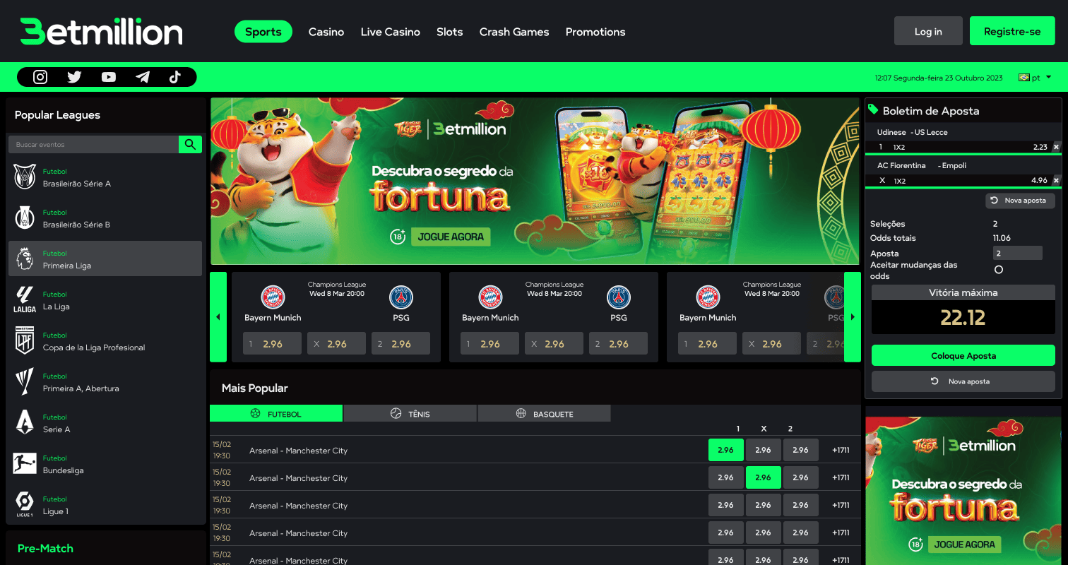
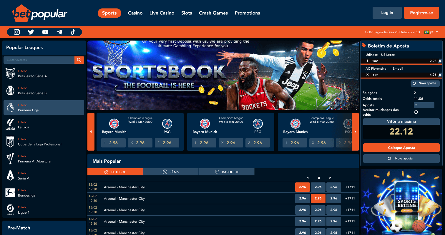
A design system is never built in isolation. While we were establishing the token architecture, the business still needed to move. We ran a dual-track approach — designing and delivering new white-label projects concurrently with building the Belloa library. Each new operator became a live test of the system's flexibility.
Token Architecture
The token system went through three distinct phases as the platform matured and engineering moved to React:
V1.0
84 tokens. Functional but brittle — every new white label required significant manual rework.
V2.0
68 tokens. First reduction pass, prompted by Pick’em’s complexity. Cleaner but still not scalable.
V3.0
44 tokens. A full semantic restructure. Brand logic decoupled from functional logic. Rapid operator onboarding, no breaking changes.
The refined architecture follows a tiered flow: Radix UI primitives map into semantic tokens, which drive themed components. Brand-specific logic is fully decoupled from core functional logic — any operator can be onboarded without touching the system's foundations.
Decoupling
A significant engineering initiative — Decoupling — ripped all interface modules out of the legacy architecture and rebuilt them properly in React. For the design team, this was the unlock we had been waiting for.
We rebuilt every component in Figma from the ground up, mirroring the new React architecture 1:1. For the first time, we had the technical capacity to introduce proper variants for complex modules — headers, footers, navigation blocks — without legacy CSS fighting every change.
Impact
— Transformed a disjointed post-merger ecosystem into a unified product design language.
— Reduced token architecture from 84 to 44 — accelerating white-label onboarding across 15+ operators globally.
— Figma components mirror React architecture 1:1, eliminating a full class of QA errors.
— Shifted the design team from reactive screen-scrapers to a proactive, empowered design organisation.
Belloa is still evolving. Token documentation via Storybook and Supernova is underway. The system that started as an audit of broken screens now powers white-label platforms across Europe, Brazil, and beyond — and it's built to keep scaling.
Get in touch →