Translations
Belloa Back Office Redesign
Product Design Manager · 2 Designers, 1 PM · 6 Months · 2024-2025
Project Overview
The Belloa Back Office is the administrative hub used daily by WA Technology's internal operations teams and operator clients. As the platform scaled, the interface had become a liability — built on a legacy INSPINIA framework with dense form layouts, 11px Arial type, dark sidebars, and zero design coherence. Staff were slow to onboard. Operators flagged usability issues. The product didn't reflect the quality of what WA Technology had become.
This case study covers a three-phase redesign I led across 2025, built on a foundation of user research, systematic component work, and close alignment with the WA Belloa Design System.
The Problem
The back office was never designed — it accumulated. Features were layered onto a legacy admin framework over years, resulting in a dense, visually inconsistent interface that operators and internal staff had simply learned to tolerate. Navigation had no clear hierarchy. Interaction states were undefined. The visual language was disconnected from everything WA Technology had been building toward with the Belloa Design System.
The goal wasn't cosmetic. It was to make a complex, multi-role platform feel trustworthy and fast — and to lay the groundwork for a scalable, role-based experience as the operator portfolio grew.
Phase 1 - Structural Foundation
Jan-Feb 2025 · Completed
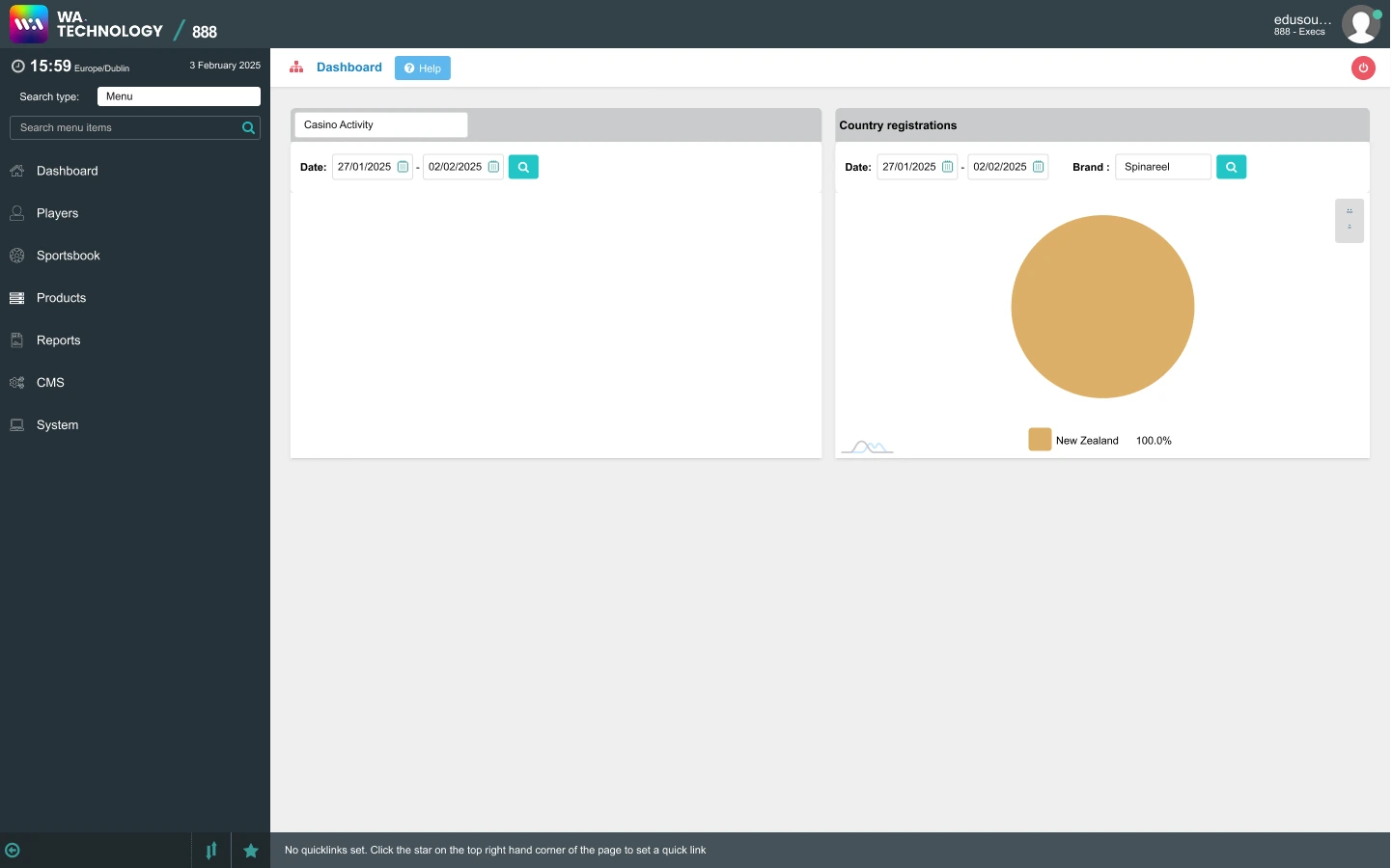
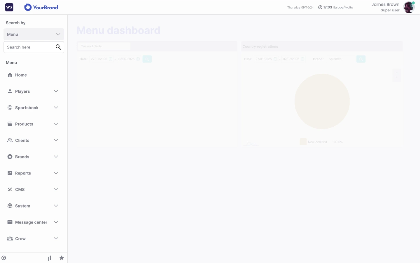
The first phase tackled the most immediate pain point: navigation. The legacy side menu used a dark #253137 sidebar with small unlabelled icons, no interaction states, and no search. It had grown organically and become difficult to scan.
I defined the design direction for this phase entirely — the structural approach to the new sidebar, the light-mode Belloa-aligned header, menu search, and interaction states for hover, active, and collapsed. I also introduced a date and time component to the header, a frequently referenced element that had been inconsistently handled across the platform.
The contrast between the legacy interface and Phase 1 output established the visual and structural baseline for everything that followed.
Phase 2 - Research and Refinement
Mar-May 2025 · Completed
With the structural foundation in place, I shifted focus to understanding users before designing further.
I led a full research cycle: conducting one-on-one interviews with six participants — five internal users across operations, account management, business intelligence, customer support, and engineering, plus one operator client (F12.bet, Brazil) — followed by two affinity synthesis sessions in FigJam. The team wrote and clustered insights bottom-up, then worked through Journey Mapping and "How Might We" framing to identify the highest-priority pain points.
A recurring theme emerged from the research: users were losing confidence at feedback moments. Form submissions, error states, confirmation popups — the interface gave no reliable signal that actions had succeeded or failed. Operators in particular described having to refresh pages to verify whether something had worked.
This shaped the Phase 2 design output directly: redesigned feedback and info popups, new hover states for buttons, tables, and form elements, and a more consistent treatment of interactive components throughout. The affinity diagram became a shared reference for the wider team when prioritising Phase 3.
Phase 3 - Role-Based UX
June 2025 - Ongoing
Phase 3 introduced a more strategic layer: designing the back office around the specific roles that use it, beginning with the Customer Support persona. Working from a reference document curated by the Product Manager, I directed a role-informed experience that ensured the most relevant pages for this user type were coherent, navigable, and appropriately scoped.
Alongside the role-based work, Phase 3 delivered a significant set of platform-wide improvements:
Role-Based UI Highlights
Player Information
Consolidated identity, account, and balance data in one role-prioritized workflow view.
Account Actions
Reduced support friction with clearer action grouping and more predictable button hierarchy.
Search and Filters
Improved discovery with consistent search placement and clearer filter behavior.
Navigation + Breadcrumb
Made cross-module movement easier with contextual breadcrumbs and scoped navigation states.
Feedback and Confirmation
Strengthened trust by making success, warning, and error responses explicit at key moments.
Role-Based Surface System
Aligned page density and component emphasis to support Customer Support workflows first.
Impact
The redesign transformed the day-to-day experience for both internal teams and operator clients. The Phase 1 shift from the legacy dark sidebar to the Belloa-aligned light interface was immediately visible to everyone using the platform. Operators provided positive feedback on the modernised feel. Internal staff noted faster navigation and better confidence in the interface.
The research process in Phase 2 — the first structured UX research cycle the back office had ever received — produced a body of documented insights that shaped not only Phase 3 priorities but the broader product roadmap conversation with the PM team.
Phase 3's role-based approach marks the beginning of a longer product strategy: giving different operator and internal user types an interface built around how they actually work, not just what the system can do.
Key Takeaways
The back office redesign reinforced something I've found consistently in B2B product work: legacy platforms don't need a full rebuild to feel fundamentally different. Structural navigation, consistent feedback patterns, and a coherent visual language can transform how a product is perceived — and trusted — without touching the underlying architecture.
Running the research myself, from interview guide to affinity clustering, made the design rationale defensible across every stakeholder conversation. When Phase 3 priorities were questioned, I could point to documented user behaviour, not intuition.
Get in touch →Next projectRoadReady →