WA Fantasy Pick'em
Product Design Manager · 3 Designers, 1 PM, 6 Engineers · 9 Months · 2024
Context
Most sportsbooks were built for a different era — designed for desktop, for experienced bettors, and for markets measured in decimal odds. The modern fan, one who follows LeBron or Messi rather than a team, was largely ignored.
Opportunity
B2C disruptors like Underdog Fantasy and PrizePicks had proven that simplifying betting into a binary More or Less choice could unlock an entirely new audience. No B2B equivalent existed. The opportunity was to build the first white-label Pick'em engine that any operator could plug in and own.
Benchmarking
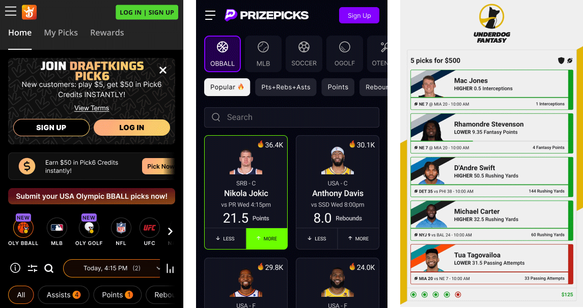
We conducted competitive analysis against the leading B2C disruptors. DraftKings Pick 6 informed our navigation and player card hierarchy. PrizePicks had perfected the high-velocity betslip — fast, addictive, frictionless. Rather than copy either, we synthesised what worked and designed a B2B-native version: fully themeable, delivered as an iFrame through existing casino aggregators.
Design Iteration
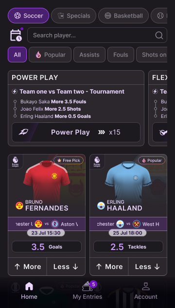
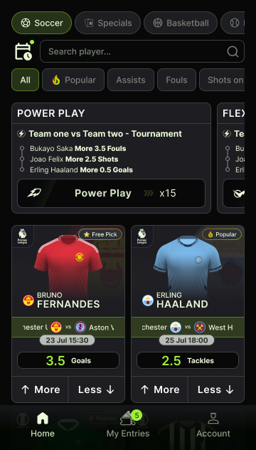
What followed was several sprints of design exploration, internal playtesting, and iteration — building the Pick'em library screen by screen. Player cards, bet slips, multiplier displays, outcome states. Each component tested internally before moving to the next. The challenge was keeping the experience feeling like a game at every touchpoint, not a financial product.
The Visual Foundation
Because Pick'em was a B2B product, multi-brand scalability was non-negotiable. We adopted purple as the primary accent and built on Radix UI colours, pairing it with Radix's Mauve as our neutral base.
Pizza Logic
The interface featured multiple overlapping layers, panels, and drawers. To maintain consistent depth and contrast across any white-label theme, we coined the Pizza Logic: the bottom layer uses the darkest Radix surface tokens, and as components stack on top — like toppings — each layer steps one level lighter up the scale. WCAG-compliant contrast at every depth, across every brand.
Token Architecture
Our initial framework required 84 tokens to style a new white label. The complexity Pick'em introduced became the catalyst for a token reduction initiative I led across the company — bringing the architecture down to a 44-token semantic layer that could support rapid operator onboarding without breaking.
Read more in the WA Belloa Design System case study →Launch
We launched the first Pick'em brand for F12, our primary Brazilian client, under the name Chute Certo. F12 had been struggling to cross-sell players from their Casino to their Sportsbook — a 5% drop in that conversion funnel. Chute Certo bridged that gap: familiar enough for casino players, engaging enough to keep them.
With the foundation live, Pick'em is now in the pipeline for Manat365 in Azerbaijan, Poligon in Turkey, and SpinPokio in Australia — validating the scalability of the system we built.
This project is the result of a talented cross-functional team — designers, engineers, and product leads working in close alignment over nine months. My role spanned the full product lifecycle: from the initial UX direction and design system architecture to internal playtesting and iteration. Winning Sports Provider of the Year 2024 was a reflection of that collective effort.